Slide:ology by Nancy Duarte
The art and science of creating great presentations
Presentation software is one of the few tools used by professionals that require them to think visually on a daily basis. But unlike verbal skills, effective visual expression is not easy, natural, or actively taught in schools or business training programs. Slide:ology fills that void.
With Slide:ology, you’ll learn to:
- Generate ideas
- Translate ideas into informative graphics
- Sketch and diagram effectively
- Create slides an audience can process
- Utilize presentation technology to your advantage
The most successful TED speakers spread brilliant ideas following the timeless principles in this invaluable book. It’s a safe bet we’ll be sending this book to all future presenters just as soon as they confirm!
Tom Rielly, TED Conferences
Published 2008 by O'Reilly
WWW Content
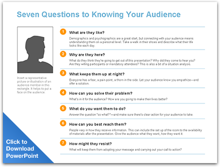
Audience Needs Map
Page 15
The audience didn’t come to see you, they came to see what you can do for them. If you fill out this audience persona slide, it will give you insights into how to present in a way that will resonate with your audience.
Sketching With Diagrams
Page 29
Click here to see how you can create wonderful concepts if you step away from the computer. Avoid going straight to stock photo web sites. This concept was developed and then photos were shot with a digital camera.
Traversing Dimensions
Page 121
Download this PowerPoint file to deconstruct all the layers used to create the lighting effects on this slide
Text Animation
Page 155
Well typeset text can animate in an engaging way. The way the type was set drove the animation concept. Watch how the text integrates as animates.
HOW’D THEY DO THAT?
Each set of text was built in Illustrator. This way, we could quickly experiment with different type treatments to find the perfect balance of contrast and hierarchy.
Once one treatment was settled on, it was easy to convert the text to outlines (Type > Create Outlines), converting the text into Illustrator shapes. We then selected the converted group of text in Illustrator, copied it, and pasted it into PowerPoint using the “paste special” feature (Edit > Paste Special).
Using this feature allows you to paste into PowerPoint as a specific file format. To create the effect we wanted, we chose to paste as an enhanced metafile. This allowed us to break the text “picture” using the Ungroup tool in PowerPoint, turning the letters into editable shapes that could then be individually animated.
A similar effect can be acheived without leaving PowerPoint. Create individual letters as text fields or Word Art. Then they can be individually animated.

Complex Stories
Page 170
This entire sequence tells a story of how the IT team (dressed as a guard in this case) helps protect the company using security software for early detection.
Incorporating Video
Page 176
Because this presentation has embedded video, it was developed in Keynote which can handle higher quality video than PowerPoint.
Animation Serves a Purpose
Page 184
Animation should tell a story or can even simulate a small movie clip. This flip-book style animation was created by taking a series of photos and animating them in PowerPoint.
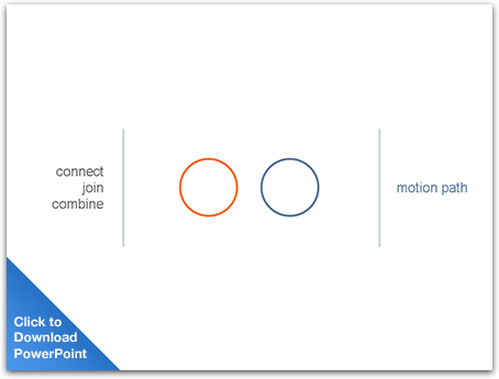
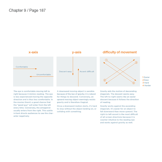
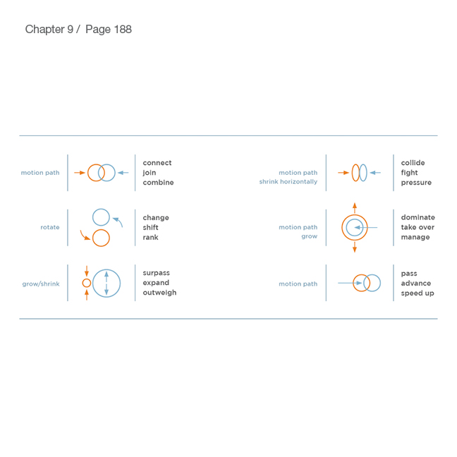
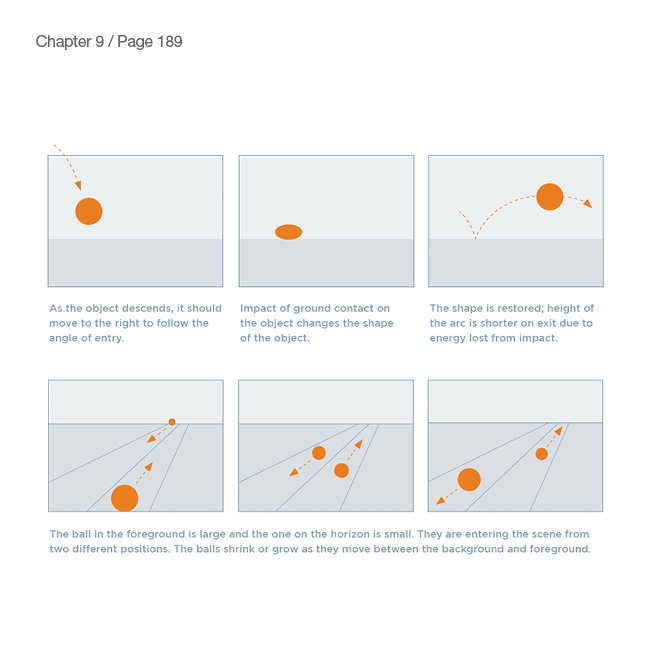
Objects Move and Change
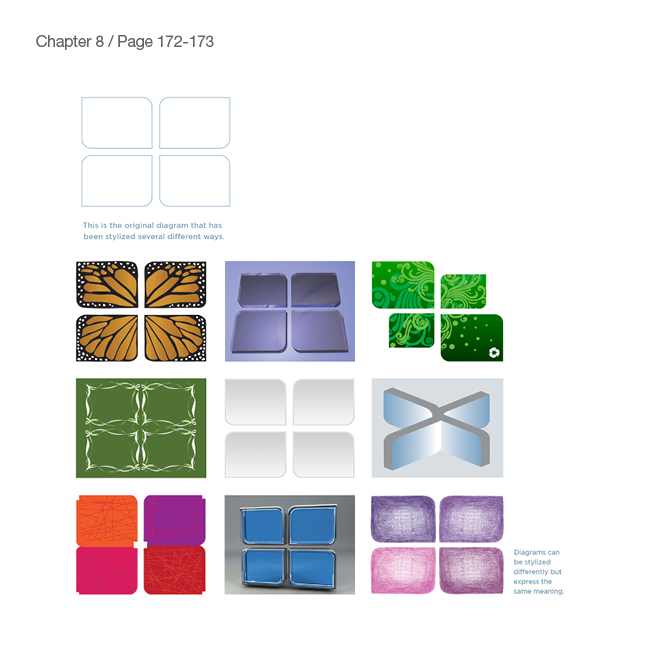
Page 188
These schematics show the use of two animations to convey a message. When the two effects are played together they create a new meaning.
Creating Scenes, Not Slides
Page 192
Instead of snapping from slide to slide, pan through a scene. This gives a larger sense of space and connects the scenes together. It makes the content feel united together.
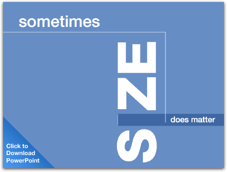
The Sum of its Parts
Page 195
You can also pan across a shape or path to create an element of surprise.
Combination Lock
Page 197
Familiar metaphors can help the audience grasp how your product or strategy works.
All the World's a Stage
Page 198
A clever use of animation is to control the movement of cast members as they enter and exit your story.
The Sky is the Limit
Page 238
Watch Sky deliver her quick-paced style at ComiCon 2007. This was her first presentation on the tour and by the end of the tour she was delivering over 200 slides in 8 minutes
Assets
Feel free to use these images from Slide:ology in your next blog article or presentation.


Thank you for your inquiry! We will be in touch soon.
Close